
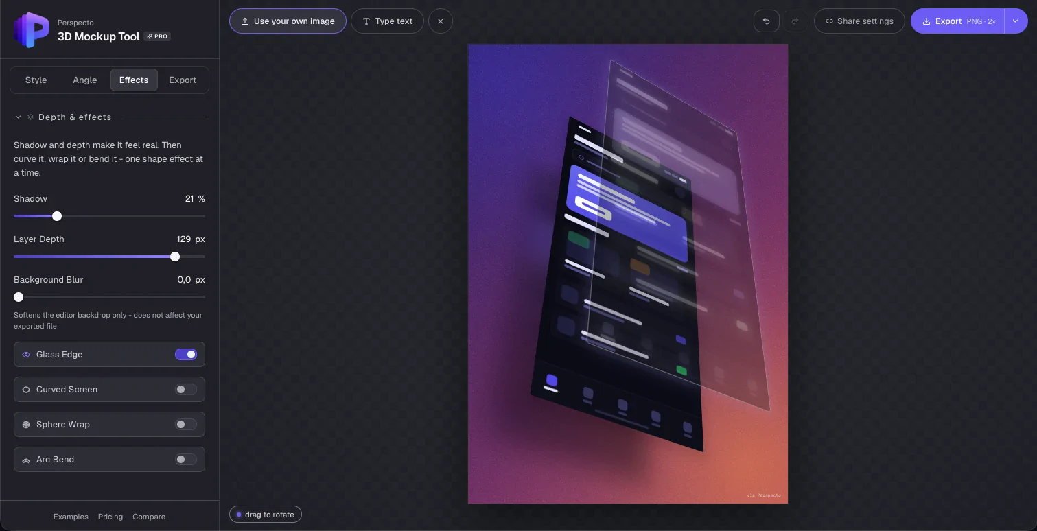
The problem
I needed this for my own work.
As a designer I constantly present flat screens: app screens, dashboards, landing pages. They look better with depth, and the usual ways to get it were all too slow for something I needed every week:
- Open Figma, find a 3D mockup plugin, configure it, then export
- Pay for a mockup service whose templates never quite fit
- Skip the polish and ship a flat screenshot anyway
I wanted to drop an image in and get a result in under a minute, without breaking my flow. That gap became the whole premise.
Audience
Broader than one designer's case studies.
Once people started using it, the audience turned out to be much wider than me:
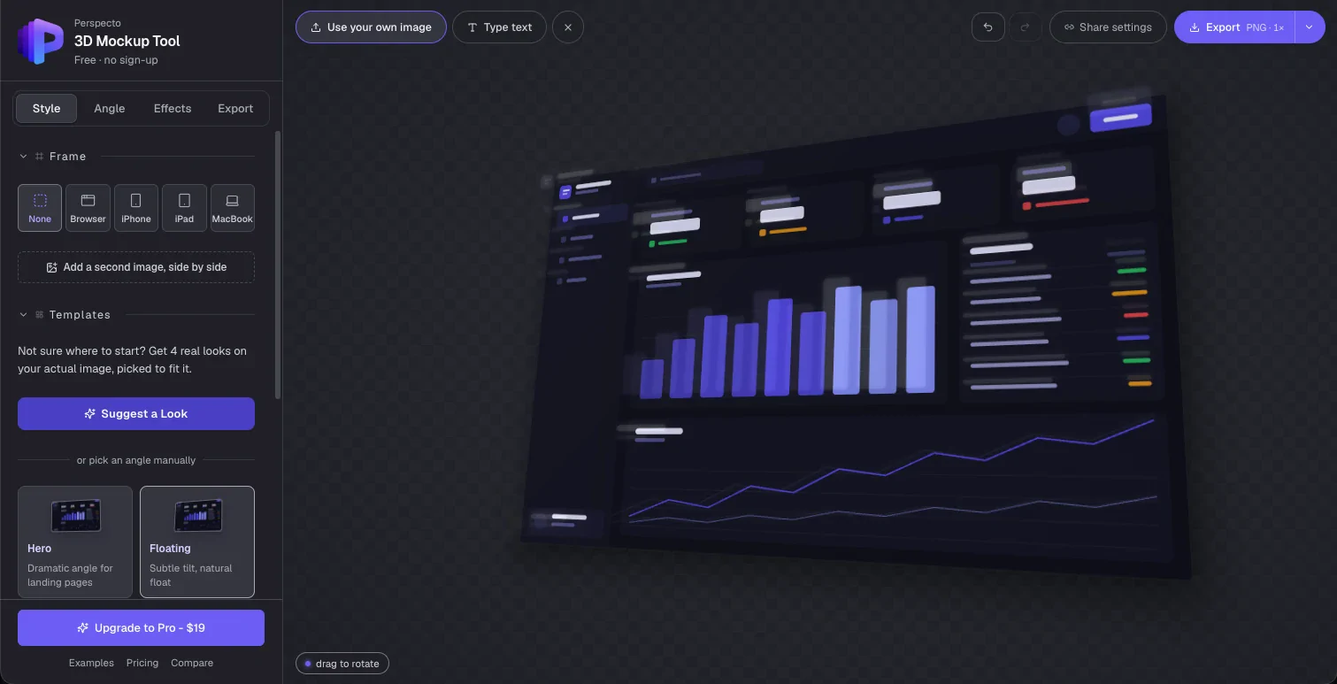
First-time visitors can try three demo types before uploading anything, Dashboard, Mobile app and Website, so they test the tool against something close to their own use.
Design decisions
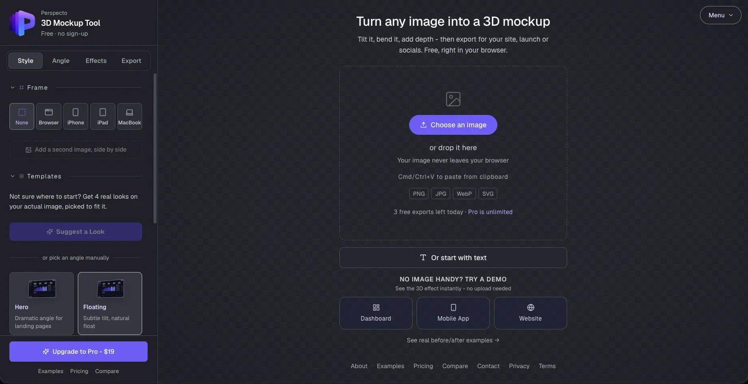
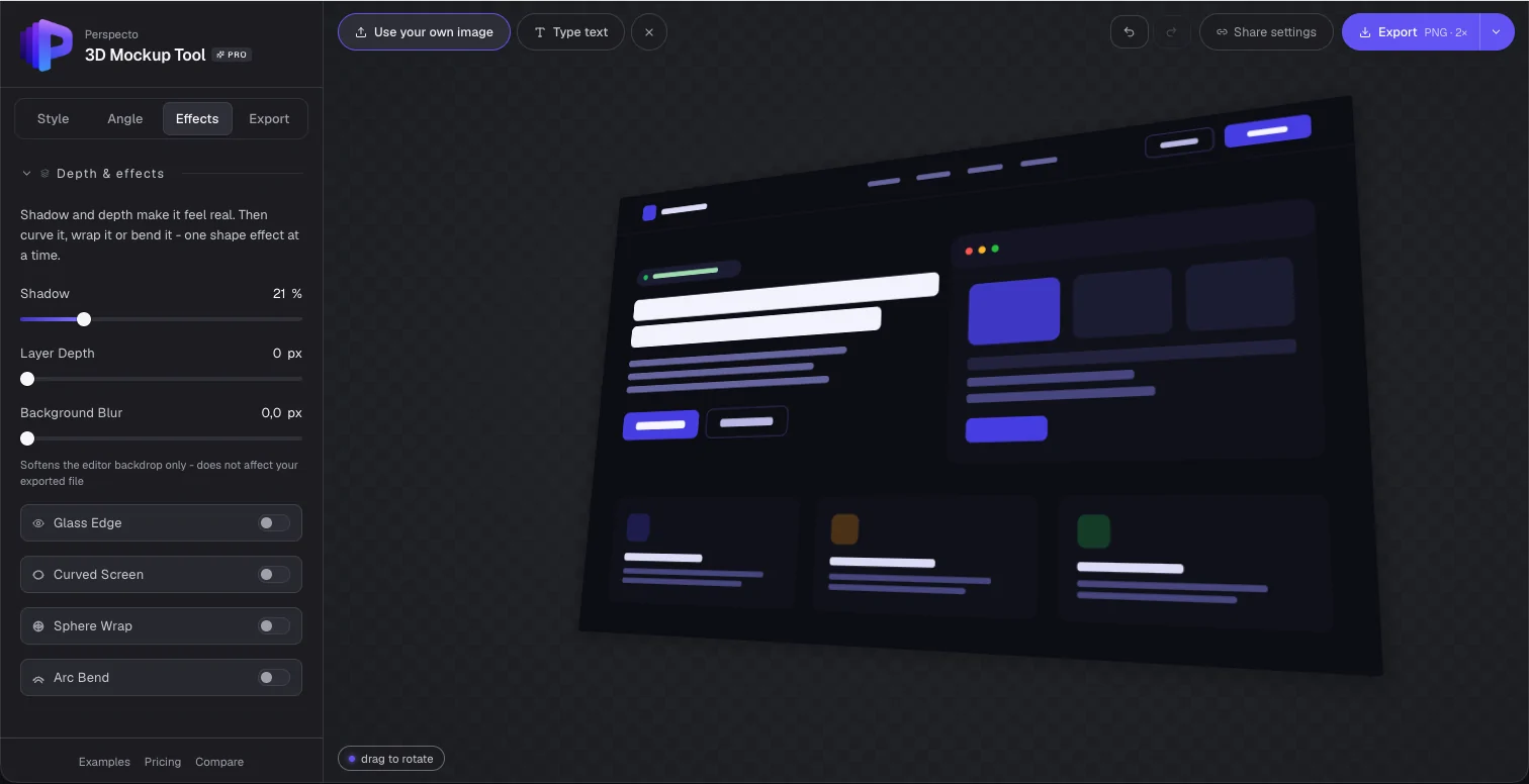
The sidebar follows how people think, not how settings are grouped.
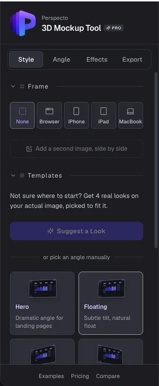
It is ordered the way someone moves through the task, not the way the underlying settings would naturally cluster:
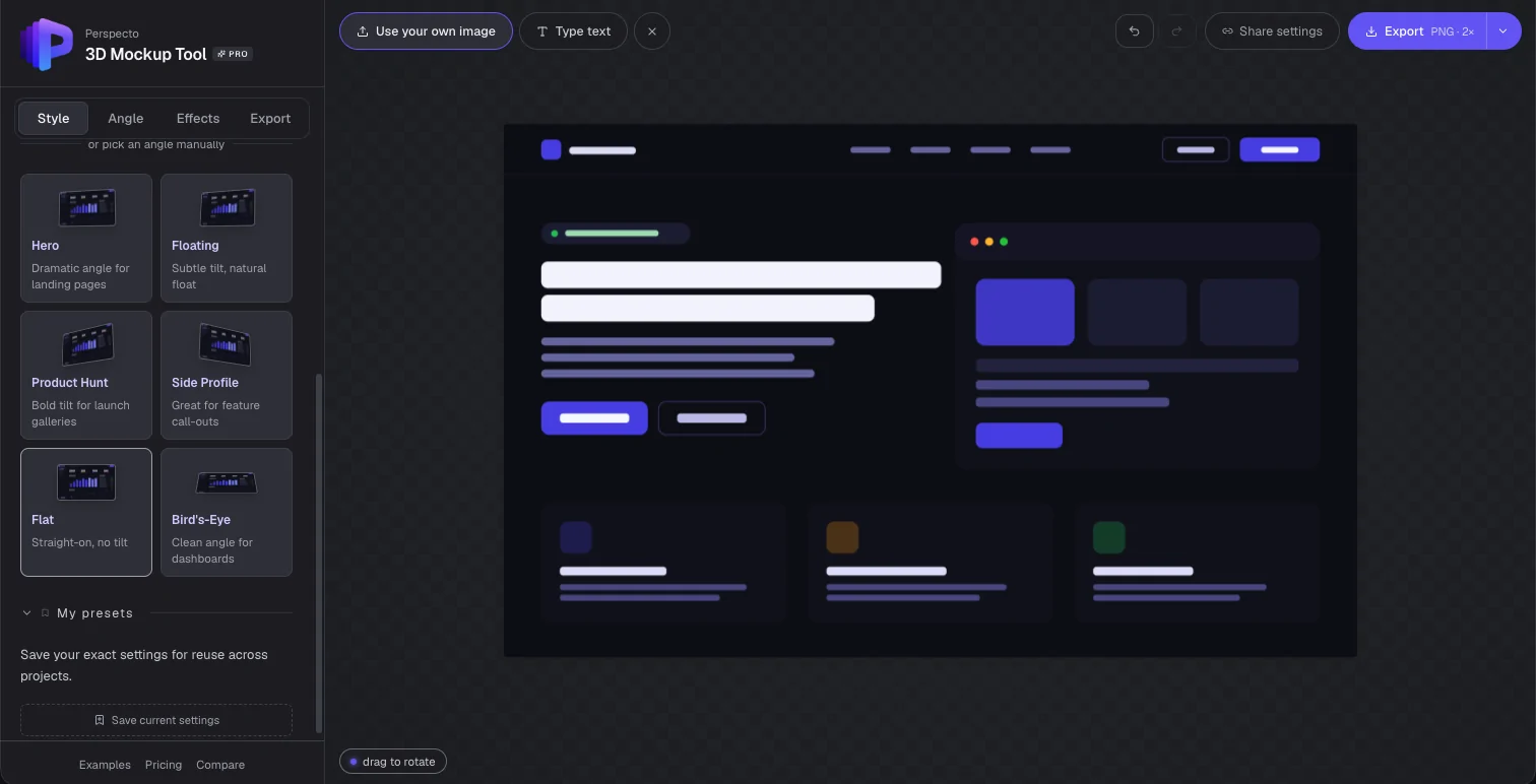
- 1StyleA device frame and a template: a result in one click
- 2My presetsA returning user's exact setup, back in one click
- 3AngleManual fine-tuning, once the angle matters
- 4EffectsShadow, depth and curves, once the angle is right
- 5ExportDecided last, because it depends on where the image is going
A first-time visitor never scrolls past anything harder than picking a preset. The depth is there when they need it.
Pricing
Free is genuine, not a teaser.
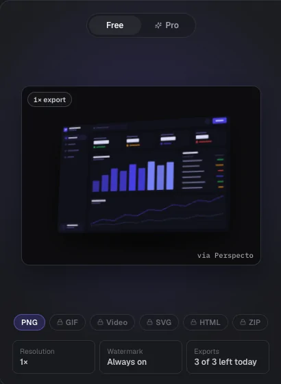
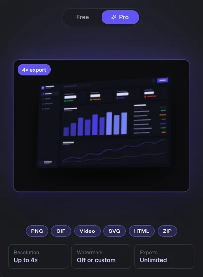
Free users get every angle, template and effect, with 3 exports a day at standard resolution and a small watermark: enough to properly evaluate the tool. The $19 one-time Pro upgrade follows one rule: anything that saves repeated time is Pro. The core single-image experience stays free.
Two things I avoided on purpose. No subscription, because a one-time payment fits how occasionally most people need this. And no AI or credit-metered Pro features, so nothing in the paid tier carries an ongoing cost that could force a price change later.
Positioning
One wording change, a much wider audience.
Perspecto was first positioned around "screenshots", from the tagline to the drop zone and the page title. Someone thinking of a phone screenshot wouldn't connect that to a Figma export or a product photo.
Turn your screenshots into 3D mockups
Turn any image or design into a 3D mockup in seconds.
I rewrote the tagline, drop zone, meta tags, structured data and FAQ, and kept "screenshot" only where it was literally accurate, like App Store screenshot guidance.
User feedback
The two features I'm proudest of weren't my idea.
The curved screen effect
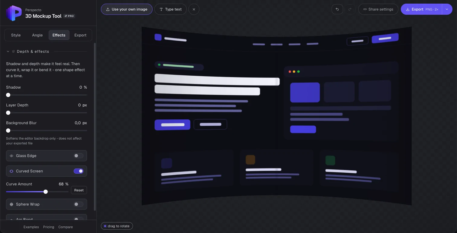
Someone trying the tool asked about curved monitor mockups. A true curve would have meant rebuilding the renderer in WebGL, but the same person suggested a cheaper approximation. That became the first version: a CSS-only curve that combined horizontal compression, an edge-darkening gradient and a soft centre highlight. It shipped in under a day because the scope stayed small.
It held up straight on, but not once you turned the mockup. After comparing Perspecto with the mockup tools people already pay for, I rebuilt it as real geometry: the screenshot now wraps onto a slice of a cylinder, so the edges bow correctly from any angle, in the editor and in every export.
The reset toggle
The same person came back wanting to compare curved and flat versions. My first pass switched the effect off entirely, which wasn't what they meant: they wanted to compare intensity. I rebuilt it as a toggle that snaps the intensity to a default and remembers the previous value, so a second click restores exactly where they were.
The first version came fast. The product came from everything after it.
Small interactions like that toggle are only right when you go back to the actual feedback instead of assuming you understood it the first time.
Building with AI
What building with AI actually looked like.
I described what I wanted to Claude in plain language and iterated from there. The 3D effect itself, with perspective, rotation and layered depth, came together in the first session. The time went into unglamorous debugging:
- A background colour picker that looked right but did nothing, traced to a type conversion that turned the hex value into NaN before it reached the renderer
- A ghost border behind a button, traced to a duplicate hidden element layered behind the real one
- Getting GitHub and Vercel to deploy on every push instead of needing a manual promotion each time
My role was the one I play on any product: define the problem, make the UX and visual calls, test critically and push back when something isn't right. The conversation replaced the code, not the judgment.
Outcomes
What shipped.
A live product
perspecto.io, with a working freemium payment flow, analytics and landing pages for distinct audiences.
Built from feedback
Two features shipped from real user feedback, within days of hearing it.
Sharper positioning
A full audit of how the product describes itself, removing a limit I had set myself.
A Pro tier that earns its price
Paid features that save real time, not padding added to justify a price.
What I would do differently
- Build an examples gallery earlier. Real before and after examples would convert better than asking people to try a demo first.
- Add undo, redo and the multi-demo picker earlier, instead of after the core features.
- Test the wording from day one, instead of noticing late that "screenshot" was too narrow.
Launch content
I designed the launch content too.
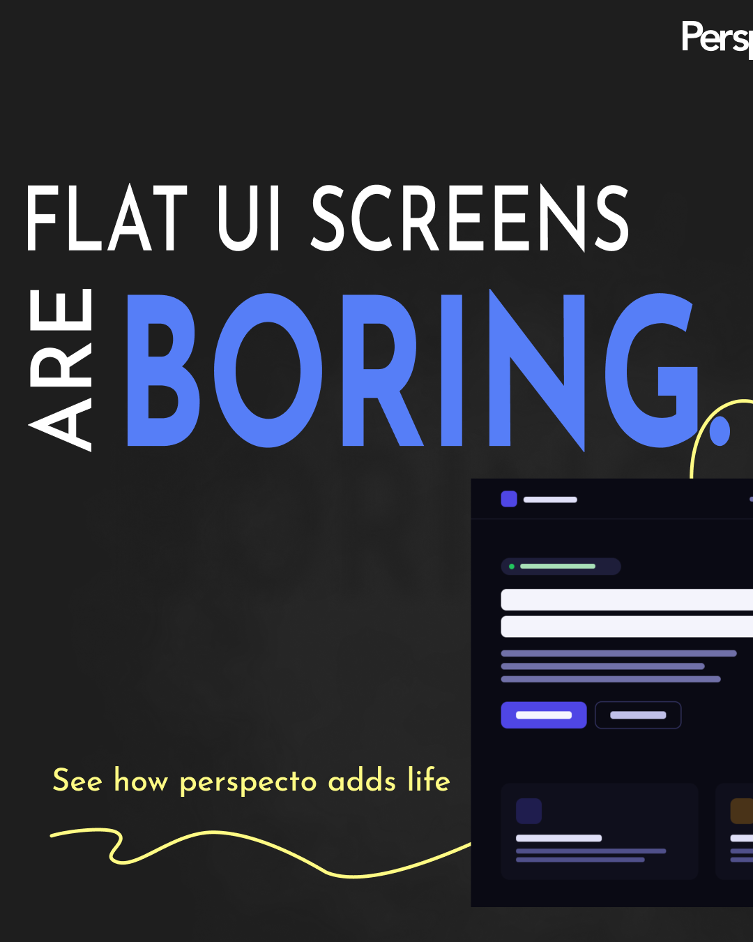
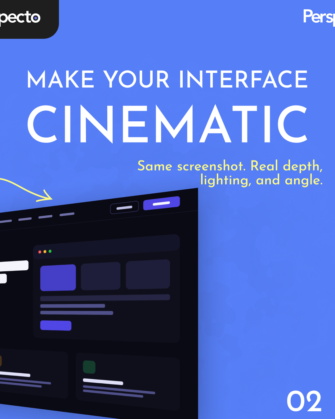
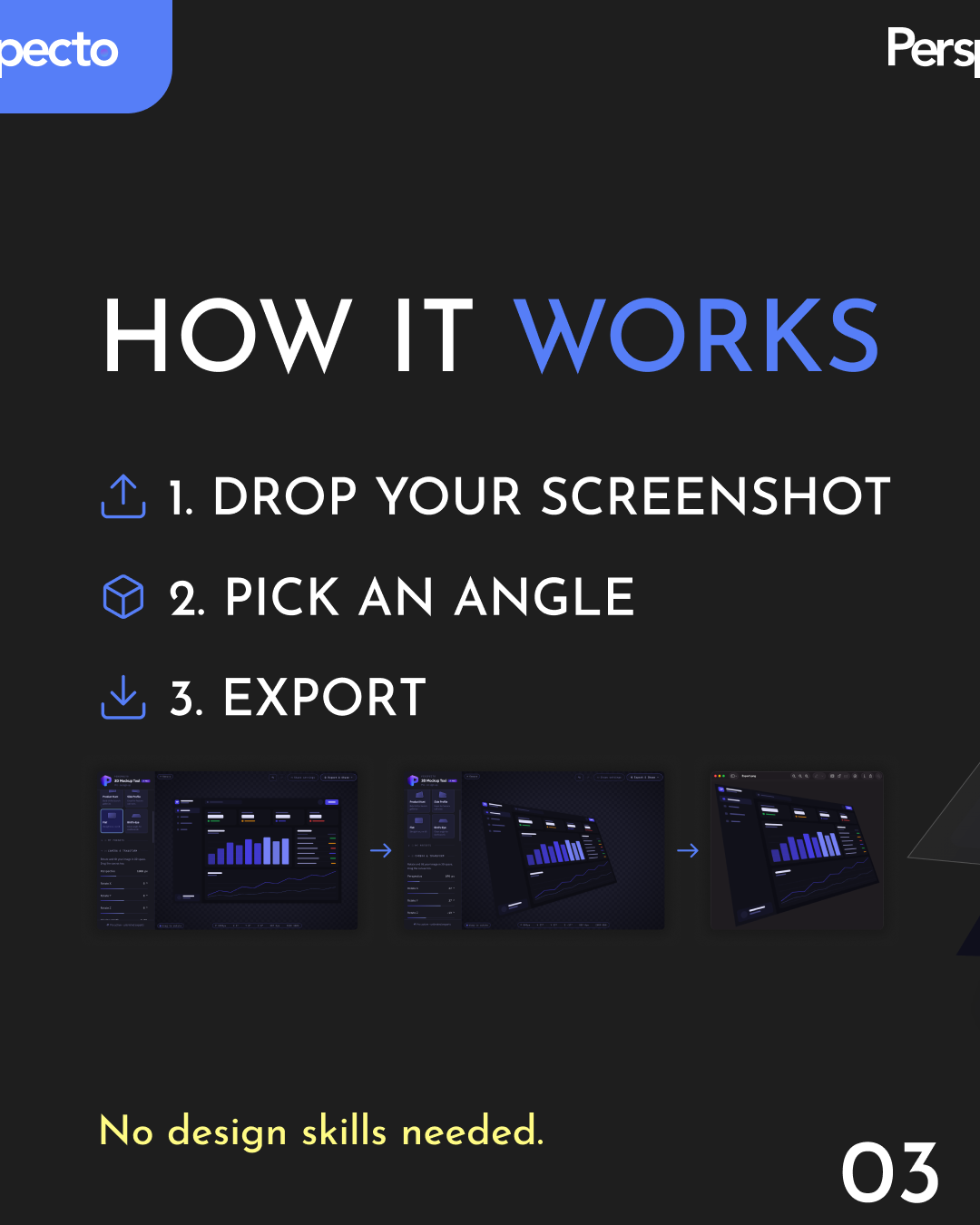
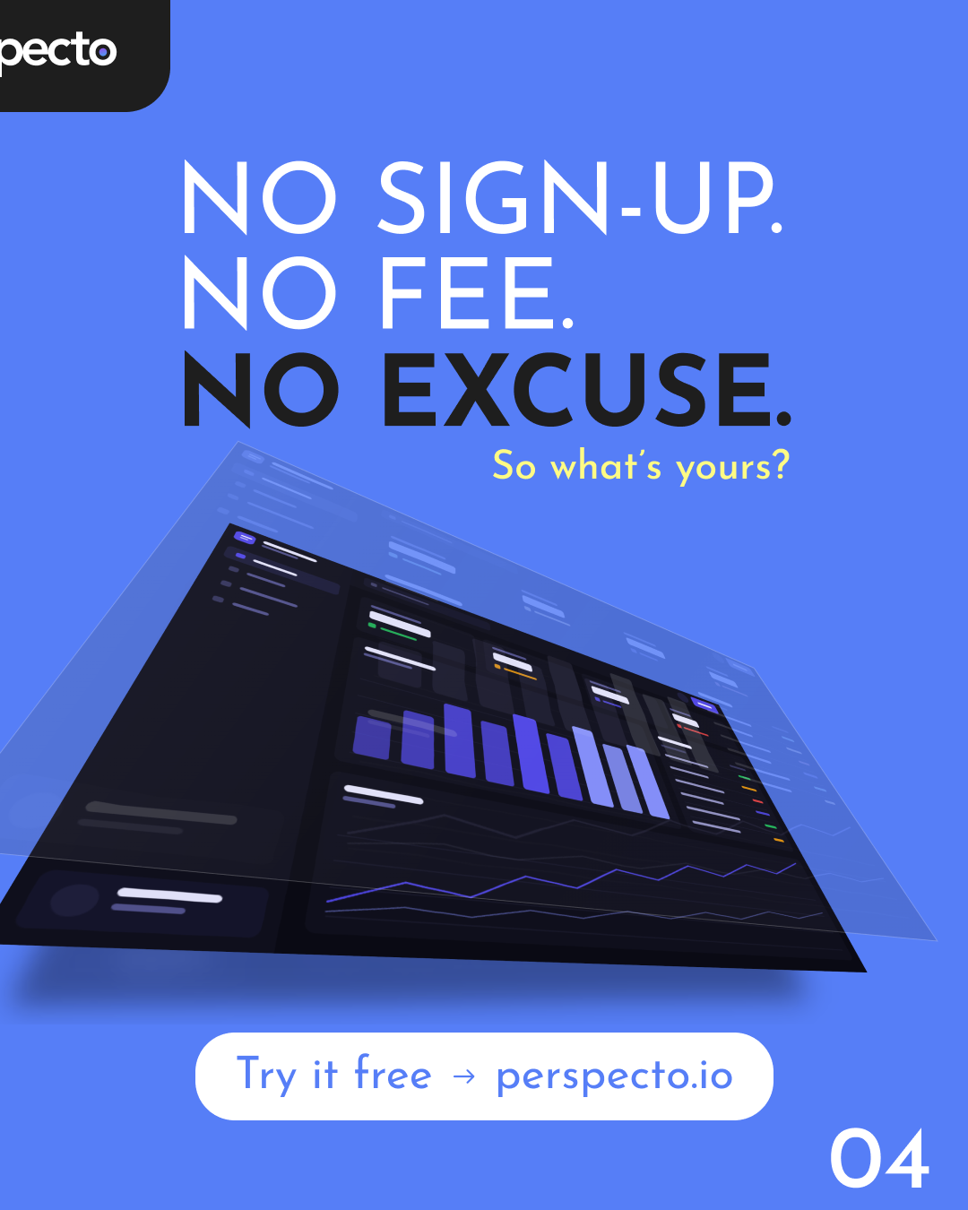
Nobody hands a solo founder a marketing team. Ads, social content and positioning were design work as much as the product screens, so they got the same bar: restraint, a point of view and nothing that looks like a template.
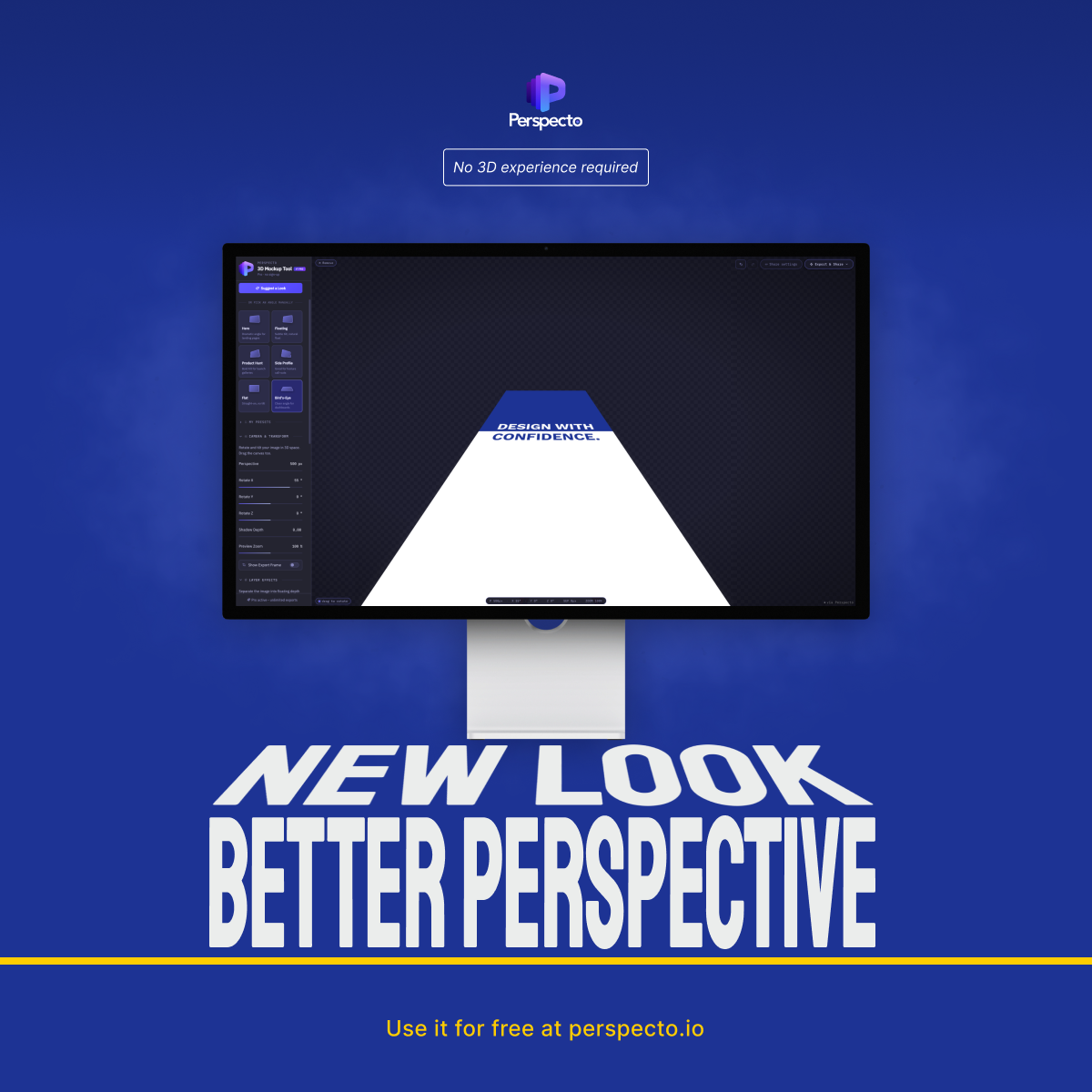
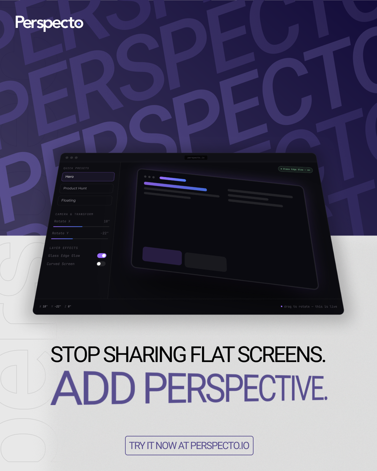
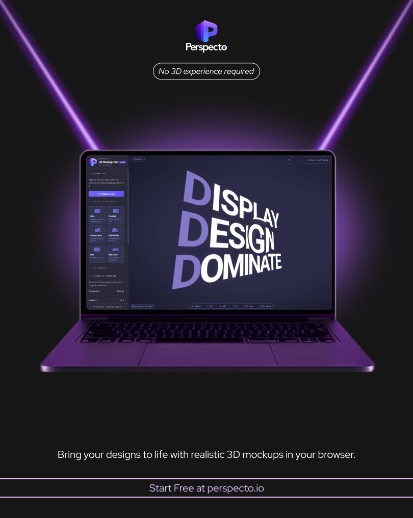
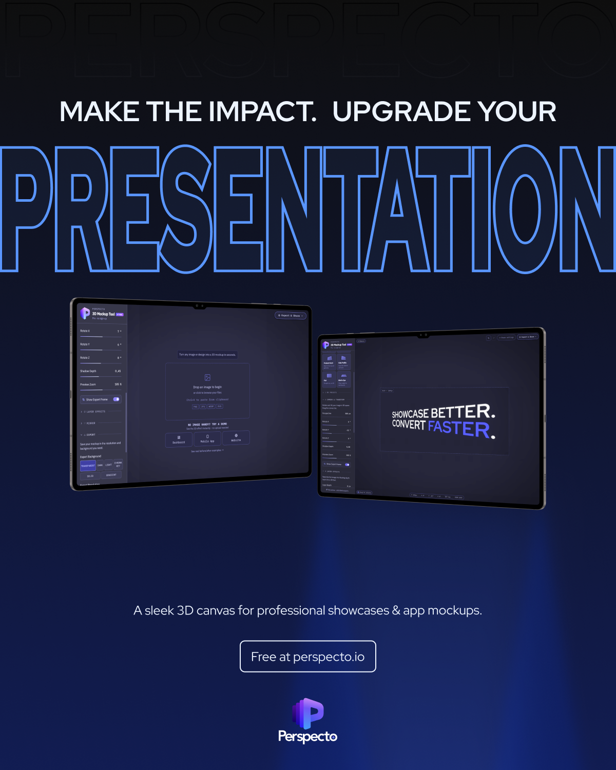
For social, I designed sequences instead of one-off images. The carousel walks through the problem, the workflow and the close in order, the same way I would structure a landing page.
Reflection
This project changed how I think about design and building.
Every meaningful decision in Perspecto was a design decision: what the free tier includes, how the sidebar is ordered, which feedback to act on, what Pro has to offer to justify its price and how the product describes itself. I made those calls and directed them into a working product.
It's a different skill from writing code, and a real way for a designer to ship a complete product without waiting on a development team.