
The brief
The protocol worked. The site around it was not ready to launch.
The core team reached out on Telegram after hearing about my work in the Stamps community. Their explorer had the data but was hard to use, and the filters in particular. They needed a product ready to launch, as soon as possible.
An explorer and toolset for Bitcoin Stamps: browse and buy stamps, track SRC-20 tokens, and create new stamps.
Collectors, artists and token traders, from people buying their first stamp to people tracking every block.
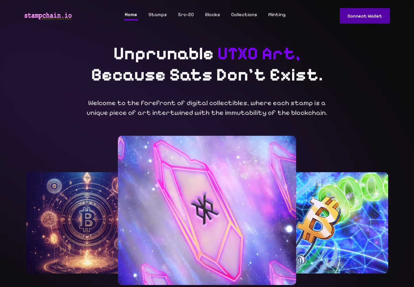
A concept the team had started in Figma, in green pixel style. I could refine it or start fresh.
I started by going through Magic Eden, the Bitcoin NFT marketplace the team pointed me to, and the other Stamps explorers. Each did something well, so I took the parts that fit and left the rest. The plan was seven pages. It grew to include wallet connection, collections, blocks, minting and deploying tokens, and a mobile version of each page.
Homepage
An overview of the whole ecosystem, not a single grid.
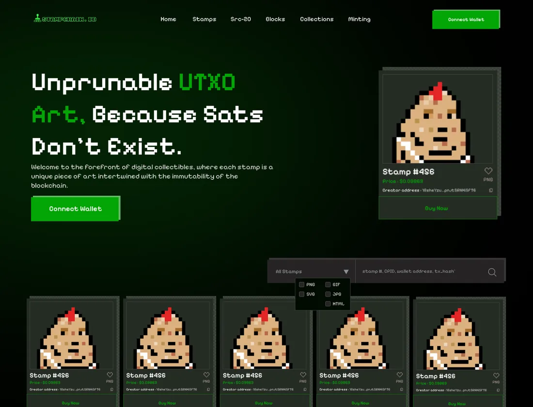
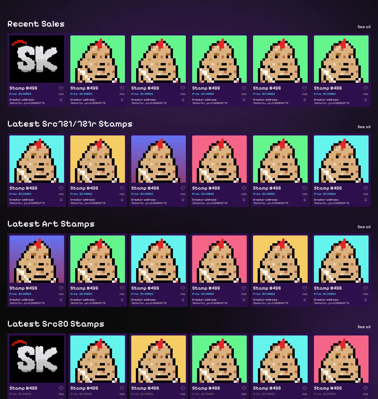
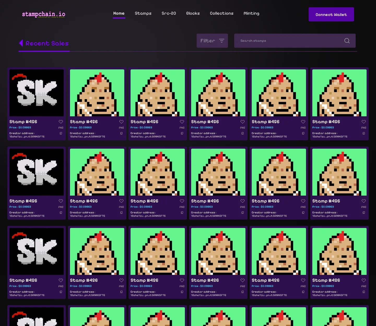
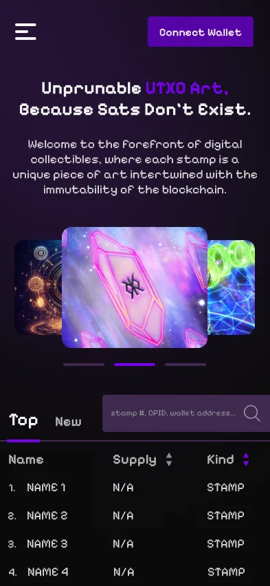
The earlier concept opened with one grid of identical cards, each with a Buy now button, and the filters above it. I turned the homepage into a summary of what is happening across Stamps, with a row for each kind of activity.
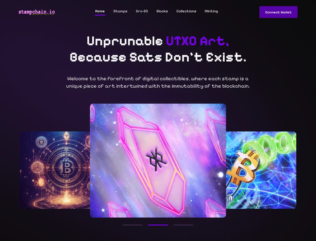
- A featured carousel at the top, so the team can promote projects
- Top and new stamps and tokens in a sortable table, for people who follow the market
- Rows for recent sales, the latest SRC-721, art and SRC-20 stamps, six per row, each with a See all link
- No Buy now buttons on the homepage. Buying happens on the stamp page, where the full details are
Explorer and filters
Filters moved to where people actually browse.
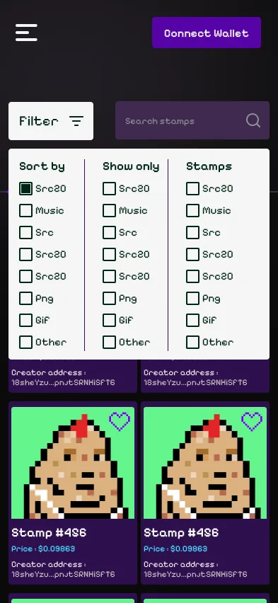
The team had singled out the old explorer's filters, and in the earlier concept they sat on the homepage. I moved them into the explorer pages behind a single Filter button next to search, grouped into sorting, what to show and stamp type.
Stamp details
Everything a collector checks before buying, without the endless scroll.
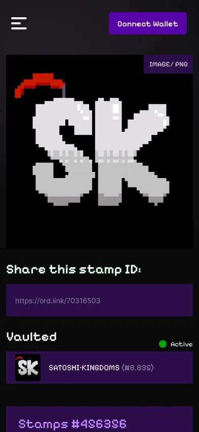
The team gave me the list of what a stamp page had to show: creator, transaction, block, supply, whether it is locked, divisible or keyburned, plus holders, dispensers and sales. The earlier concept stacked every table and chart down one long page.
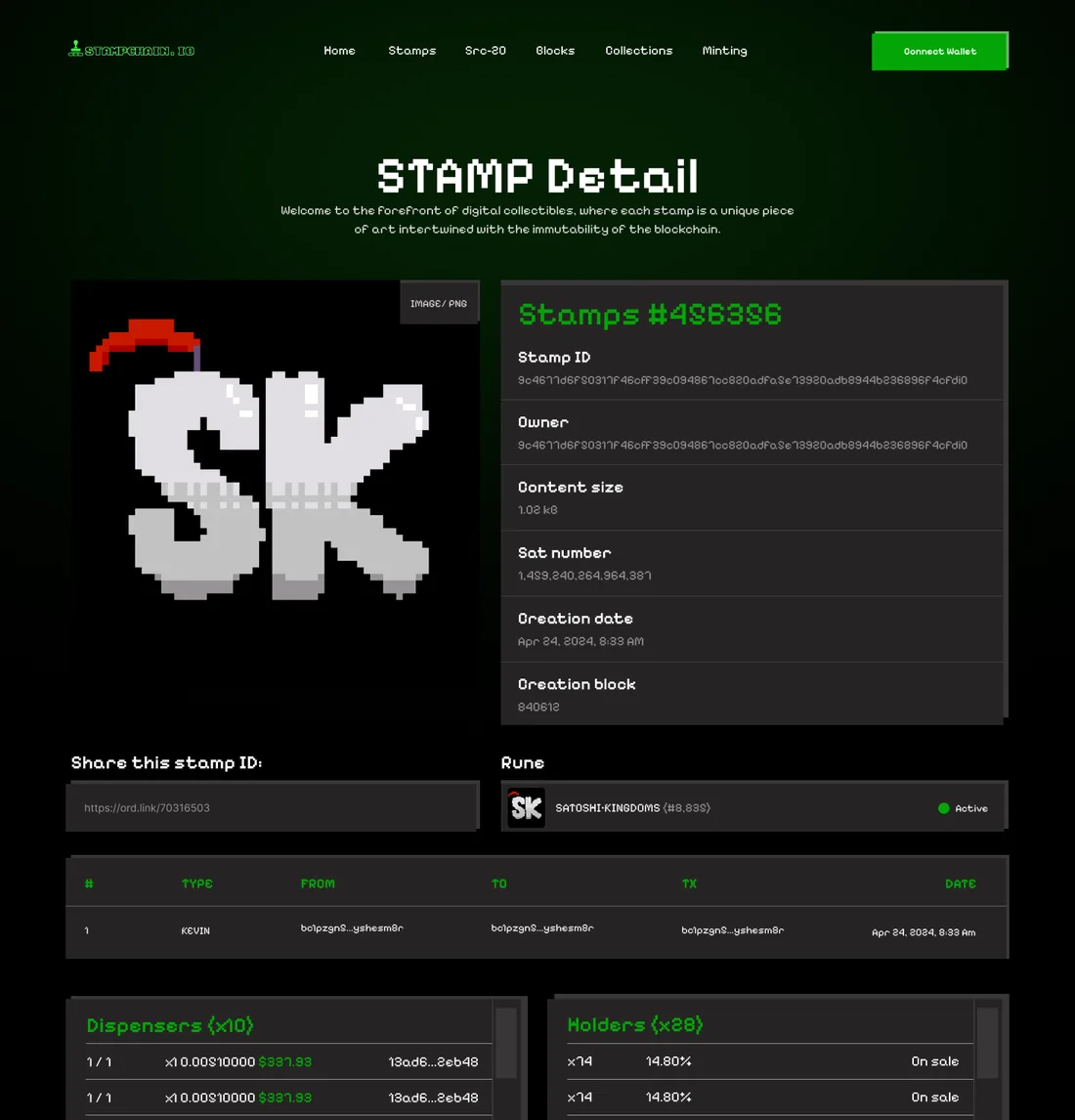
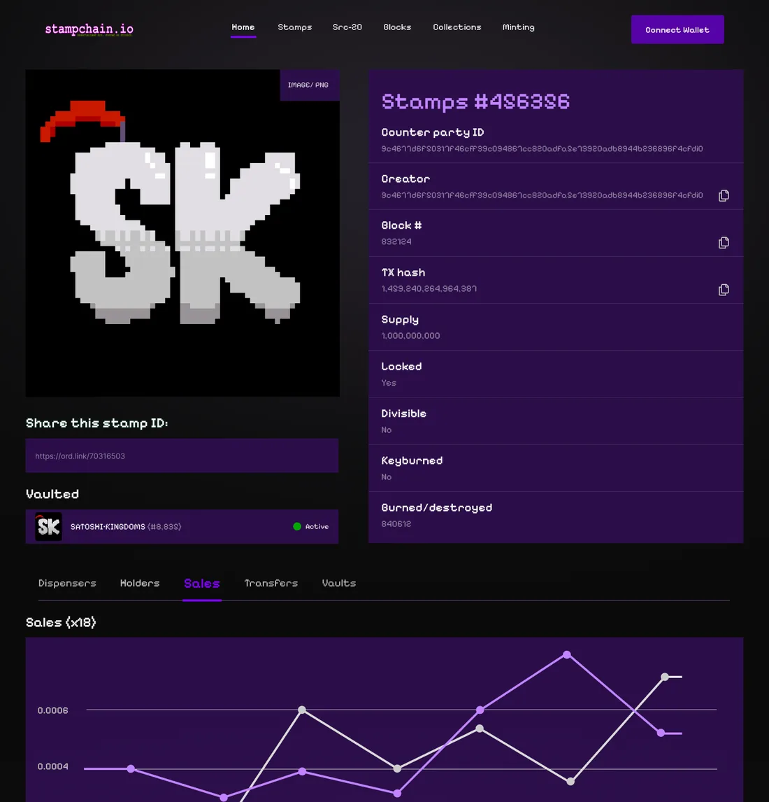
- All the facts in one panel next to the artwork, with copy buttons on the long IDs and hashes
- Dispensers, holders, sales, transfers and vaults in tabs, so the page stays short and each table gets full width
- Sharing and the vault status right under the image
Creating stamps
Know the cost before you mint.
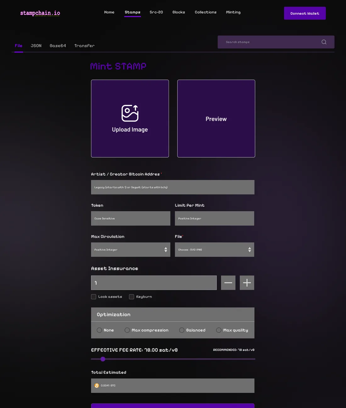
Minting a stamp costs real Bitcoin fees, and the fee depends on network traffic. The stamping tool puts the upload and a preview side by side, then a fee rate slider with the recommended rate, then the estimated total before the Mint button.
Mobile
Each page, designed for a phone too.
I designed a mobile version of each page, so the developer had a real layout for small screens instead of squeezing the desktop one.
Working with the team
Designing fast while the site was being built.
I worked four to five hours a day with the core team in a shared Telegram group, and their developer built each page as I finished it.
- Step 1Set the lookThe first three or four pages, reviewed by the team before going further.
- Step 2One feature listI asked for requests in a single list instead of long chat threads.
- Step 3Design and reviewEach page shared in the group, adjusted, then handed over.
- Step 4BuildThe developer built it while I moved to the next page.
Why I asked for one list
Ideas came from several people in a busy group chat. A single recap of what each page needed meant I designed against an agreed list instead of piecing it together from the thread.
The result
Live, and still built on the same design.
By the end of July the team said the frontend was done apart from minor details they could fix in code. Stampchain.io runs on this design today. The team has added features since 2024, but the layout, the palette and the core pages are the ones I designed.
"You're really killing it!"