Section 01 · Brief
Brief and bet.
Most AI writers solve the wrong half of the problem. They generate volume. They do not generate articles you would publish under your own name. Publizo had to fix that, without turning the product into a thirty step wizard.
The problem
Generic AI output. Output that reads like every other tool on the market. Site owners had to rewrite most of it before publishing.
The audience
Solo site owners. Operators of niche sites and small editorial teams. They care about traffic, quality, and not embarrassing themselves.
The bet
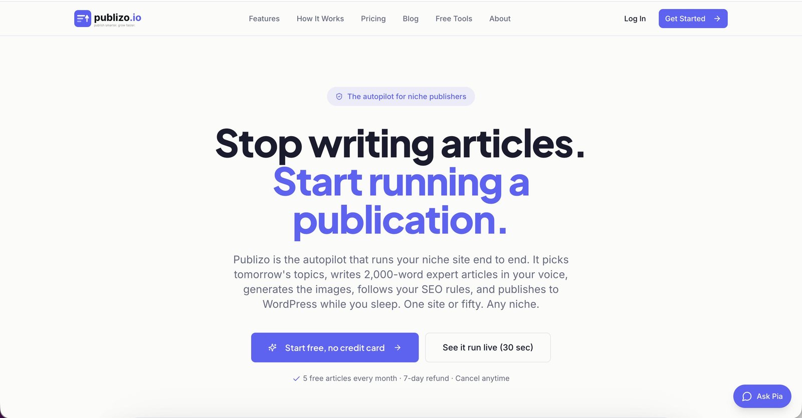
Editor first, not prompt first. If the first article looks publishable, people convert. If it looks like generic AI, they bounce in under a minute.
What I committed to: A free tier that hands the user a finished, ready to publish article on their first try. A quality gate that quietly sends weaker drafts to draft status instead of pushing them live. A visual system that does not look like a generic SaaS template. Pricing that you can understand in one screen.
As a solo team, every decision had to remove future work, not add it. That ruled out custom illustration, mascots, and a marketing site that needed weekly maintenance.
- Quiet over loud. The product is the proof.
- One clear path before three clever ones.
- Words on screen are part of the design.
- Never ship a feature that needs a tooltip to make sense.
Section 02 · Research
Research and users.
Two weeks of reading SEO forums, Reddit threads, and YouTube comment sections instead of running formal interviews. I wanted to hear people complain in their own words.
Primary persona
The Operator
Runs three to ten niche sites. Wants speed, but has been burned by content that tanked rankings.
VolumeCautiousSelf-taught
Secondary persona
The Editor
Writes well, hates the busywork. Wants a strong first draft, full control, and zero plugin clutter.
QualityCuriousOpinionated
62%
of testers asked for a "less AI" mode within the first session
3 of 4
said draft-first publishing made them trust the tool more, not less
9.2s
median time from sign in to a configured site connection after onboarding rework
"People do not want more articles. They want fewer articles they have to apologize for."
Section 03 · Architecture
Information architecture.
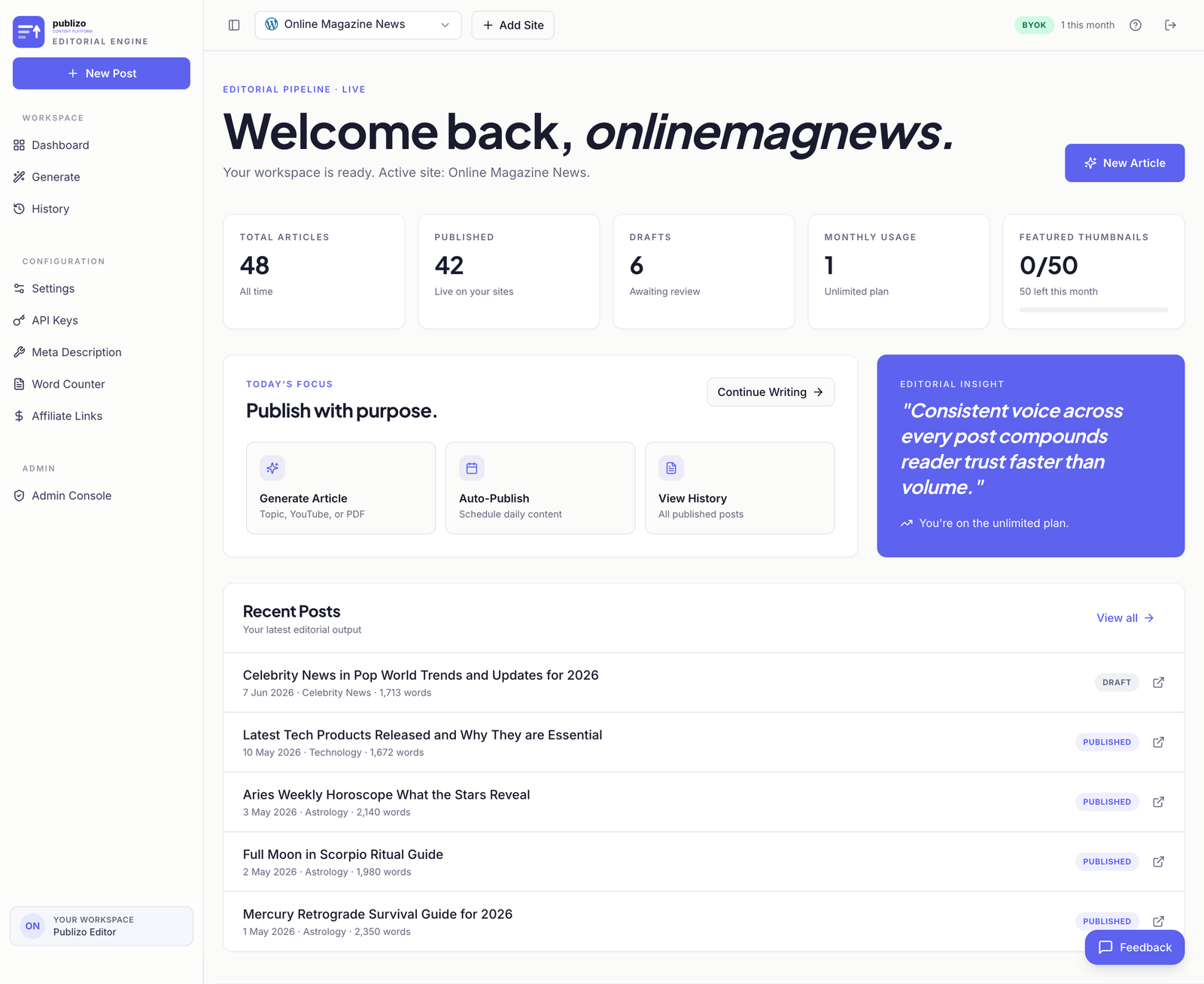
I cut the dashboard down to four real jobs. Everything else either lives behind a setting or does not exist. The free tier and the paid tier share the same shell so people are never relearning the product when they upgrade.
01
GenerateSingle article or bulk (Growth and up). The desk. Topic, source, options, publish.
02
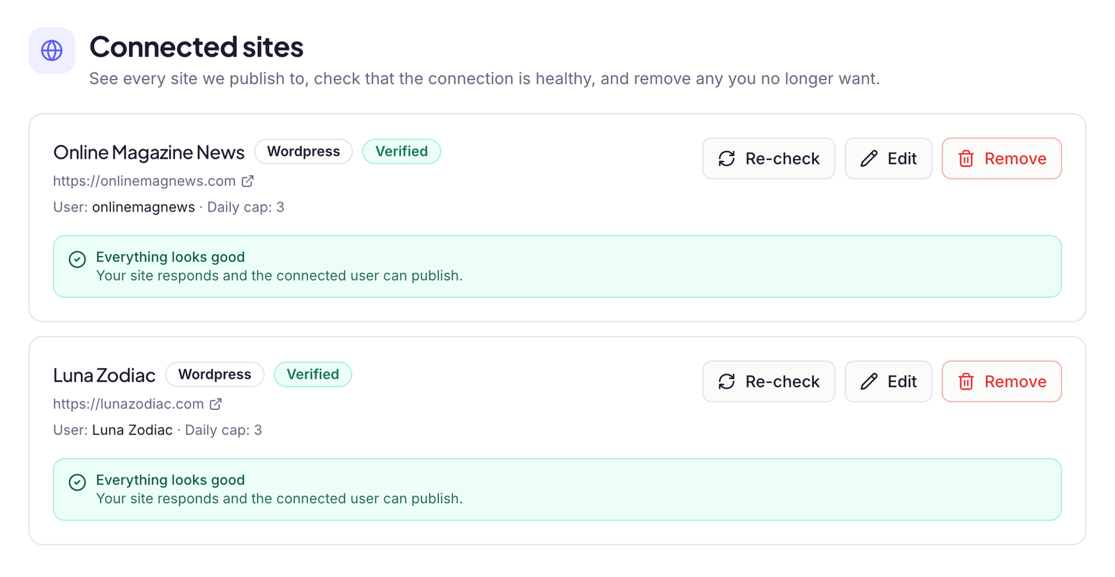
SitesConnect new site. WordPress, Webflow, Wix, Squarespace, or custom CMS. Health checks per site.
03
HistoryPublished articles and draft fallbacks. Status, quality scores, retry options.
04
SettingsBrand voice presets, billing, plan, API keys. One click away, not buried.
Why I cut templates
The topic field is the template
Templates suggest you need to learn the tool. Publizo's promise is the opposite. Tell it a topic. Get a finished article. Every competitor groups articles under "projects" too — I tested it and found the layer added clicks without adding meaning. Sites already carry the project context.
The desk — one screen, one intent
Sites — the unit of work is the site, not a folder
Section 04 · Visual System
Visual system.
The palette is intentionally restrained: warm paper, deep ink, and a single indigo accent. Combined with Fraunces and Inter, it reads as software made by someone who cares about the written word, not someone who reads dashboards.
Typography: Fraunces for display — used for headlines and editorial moments where personality matters, set at 600 weight with tight tracking. Inter for body and UI, limited to 400 and 500 weights to keep hierarchy consistent and the experience calm.
Layout: Twelve column grid, capped at 1120 pixels, 24 pixel gutters. Sections use generous vertical rhythm. Borders are reserved for moments that need a frame. Cards have a single elevation. Shadows are warm, not blue.
Motion: Custom cubic bezier of 0.22, 1, 0.36, 1. Page transitions under 240ms. Nothing bounces. Nothing slides further than it needs to.
Section 05 · Key Flows
Key flows.
The two flows that decide whether a user stays: onboarding and the first published article. I redesigned both around a single principle — show the value before you ask for the work.
01
Sign up
Google or email. No marketing modal. No tour.
02
Try a demo
Sample article with no site connected. Zero credits used.
03
Connect a site
WordPress, Webflow, Wix, Squarespace, or custom CMS.
04
Publish
Quality gate runs. Article ships live or routes to draft.
Result of the rework
Time to first published article dropped from over four minutes to under ninety seconds for users who connected on the first try. Drop-off at the credentials step fell by roughly a third.
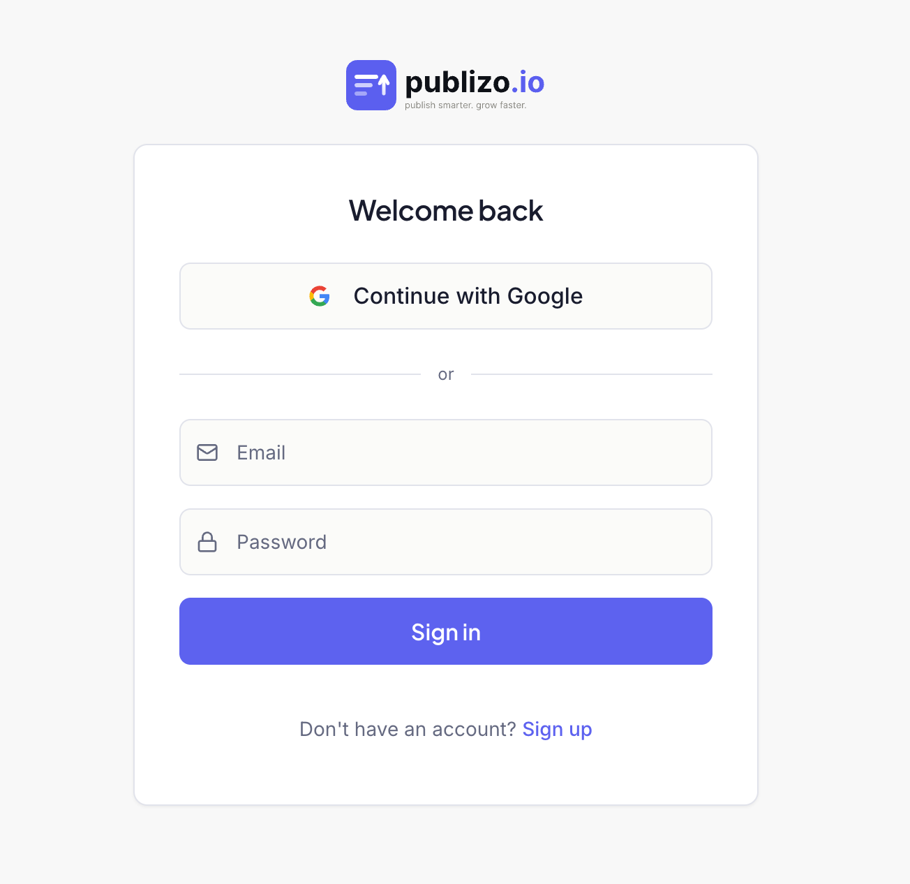
Auth is one screen, two methods
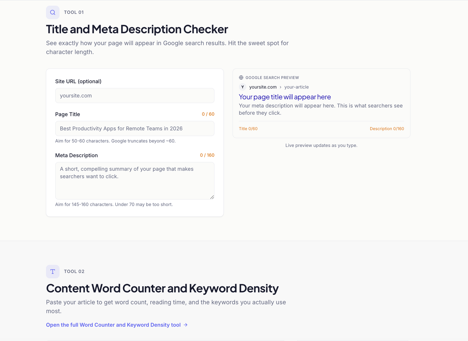
Free tools double as proof — no account needed
Section 06 · Editorial System
Make AI not feel like AI.
This was the real design problem. Not the UI. Not the dashboard. Whether the article that lands on the user's site reads like a person wrote it. Most of this work was prompt design, eval design, and writing house style rules.
Before
- Em dashes everywhere, colon titles, "in conclusion" closers
- Generic intros with no point of view
- Stock listicle structure regardless of topic
- Output published live no matter the quality score
After
- Banned punctuation and phrasing handled at the model layer
- Opinionated leads — the article takes a side in the first 80 words
- Structure decided per topic, not per template
- Quality gate sends weaker drafts to draft status quietly
Quality gate
Two retries, then draft
If the model returns a piece below the publish threshold, the system retries silently with a stricter prompt. Only after a second miss does the article go to draft — protecting the user's credits and reputation at the same time.
Voice presets. Each site picks a voice. News reads like a wire desk. Astrology reads like a thoughtful column. Commercial intent reads like a careful buyer's guide. The same engine, completely different rhythms.
Section 07 · Pricing
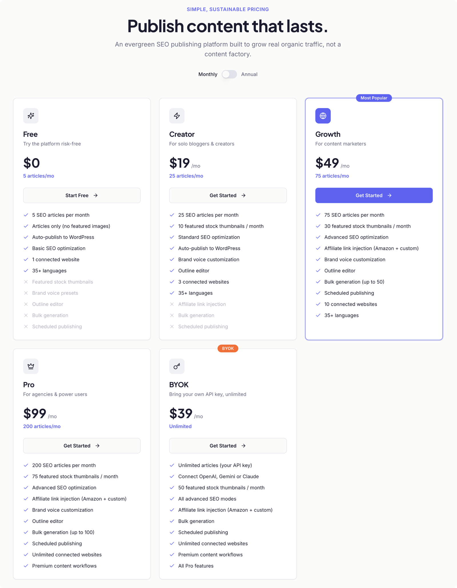
Pricing as a design surface.
Pricing is usually the page where design effort dies. I treated it as a product surface. Same type, same grid, same restraint as the rest of the app. No comparison table that needs a magnifying glass.
Free
Five articles a month, forever. Enough to feel the product, not enough to run a site on.
Creator
Monthly subscription for solo writers who need consistent output.
Growth + Pro
For operators running multiple sites. Image fetching, more credits, automation.
Founding Member
One-time payment, lifetime access. Capped at 20 seats. Scarcity that is true, not invented.
The paid tiers list what they include, not what the cheaper tiers do not. Negative selling makes the page feel hostile.
Flow fix
Intent preserved through sign-up
Selecting a paid plan now holds the intent through the sign-up flow, then sends the user straight to checkout instead of dropping them on a dashboard and expecting them to find billing on their own.
Section 08 · Reflection
Reflection and what is next.
Founder's note. While working on design projects, building products, and doing content research, I found myself neglecting my own blogs. Writing, optimizing, formatting, and publishing every article took more time than I could spare. That is what inspired Publizo — a tool that automates the busywork so I can focus on creating content people actually want to read.
What I would do differently. Ship the quality gate on day one. Most early complaints were about articles that should never have been published in the first place. The fix was the gate, not better copywriting on the marketing page.
What is next
Per niche style packs
Style packs that ship with their own house rules, built around specific verticals.
What is next
Lightweight CMS layer
For users without WordPress or Webflow — a minimal publishing surface built in.
What is next
Public quality benchmark
An AI writing quality benchmark that does not flatter the tool that publishes it.
"A tool earns its place when the person using it stops thinking about the tool."
Try It
Publizo is live and free to try
Five free articles every month. No credit card. Full editorial quality.